Some comments on the EU’s draft Privacy Icons
The European Union is currently reviewing the regulatory framework of personal data protection. In the current draft, a standardised icon set would be mandatory in some circumstances.
I’m not convinced this is the best implementation, and there’s even one icon in the set that I’m really concerned about: “Encryption”. This proposal could undermine years of activism in favour of better encryption for users.
As I’ve been working on Terms of Service; Didn’t Read for a couple of years now, I have some experience and idea about how this sort of things might work and how it compares to existing projects, especially in the fields of “Privacy Icons” where several projects coexist and keep raising much attention (including, it seems, from European legislators).
First, some context for those who haven’t followed (feel free to skip to the second part if you’ve followed personal data regulations updates in the EU). In January 2012, the European Commission announced a plan to revise data protection laws in the European Union with a draft regulation. Currently, most of the European Union’s laws on the protection of personal data come from a 1995 European Union directive. (Unlike a directive, a EU regulation is law that applies EU-wide without the need for each state to make their own internal legal implementation.)
So, this is going to be 20 years old soon. It’s quite extraordinary that even now, the directive does not seem too far off. The intentions are good and it’s a great thing that legislators foresaw the need to enhance people’s privacy back then (France and Germany already had a law for that by the end of the 1970s). But today, all this is in the middle of a huge battle.
After several steps through the European Union’s lawmaking process, the regulation is now in a consolidated draft.
I want to focus on the draft article 13a (in Chapter Ⅲ, Section 1: Transparency and modalities) which provides:
Where personal data relating to a data subject are collected, the controller shall provide the data subject with the following particulars before providing information pursuant to Article 14:
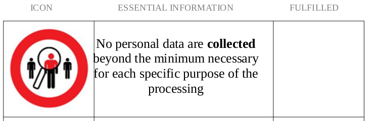
- whether personal data are collected beyond the minimum necessary for each specific purpose of the processing;
- whether personal data are retained beyond the minimum necessary for each specific purpose of the processing;
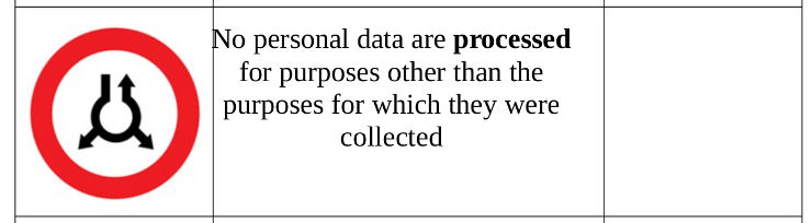
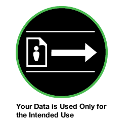
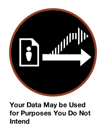
- whether personal data are processed for purposes other than the purposes for which they were collected;
- whether personal data are disseminated to commercial third parties;
- whether personal data are sold or rented out;
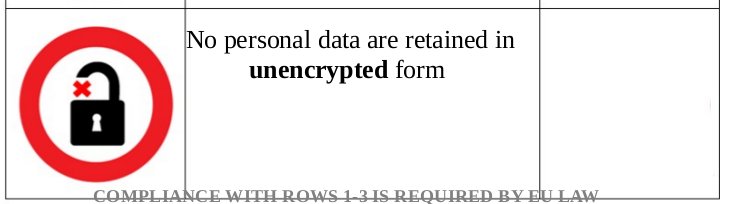
- whether personal data are retained in encrypted form.
The particulars referred to in paragraph 1 shall be presented pursuant to Annex X in an aligned tabular format, using text and symbols, in the following three columns:
- the first column depicts graphical forms symbolising those particulars;
- the second column contains essential information describing those particulars;
- the third column depicts graphical forms indicating whether a specific particular is met.
The information referred to in paragraphs 1 and 2 shall be presented in an easily visible and clearly legible way and shall appear in a language easily understood by the consumers of the Member States to whom the information is provided. Where the particulars are presented electronically, they shall be machine readable.
Additional particulars shall not be provided. Detailed explanations or further remarks regarding the particulars referred to in paragraph 1 may be provided together with the other information requirements pursuant to Article 14.
The Commission shall be empowered to adopt, after requesting an opinion of the European Data Protection Board, delegated acts in accordance with Article 86 for the purpose of further specifying the particulars referred to in paragraph 1 and their presentation as referred to in paragraph 2 and in Annex 1.
Why the “Encryption” icon is a bad idea?
TL;DR Storing sensitive data in data centers without encrypting them first is just negligence and should not be allowed. There’s no need for an icon that probably a large majority of users will not really understand.
In the draft proposal, when personal data is collected, the person who’s subject of that data should get information in the form of a standardised icon. One of the icons proposed is about encryption:
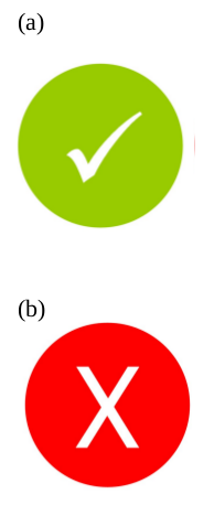
If the data is stored encrypted, then the data controller can display a huge green mark next to the icon. All is fine!
Except that it’s not. I can really see how this could get very, very confusing. It is very easy to claim that something “is encrypted” and that thus, everything’s good. I’ve heard this argument several times from Google employees: Google stores the data in encrypted forms, so don’t worry. But still, when Google access the data to process it, it is decrypted by them.
Let’s put this in context.
Following Edward Snowden’s revelations, it is very clear that encryption is one part of the solution against the intrusion in our lives that the NSA and other State agencies in the world are pursuing. Thus, it is crucial that users understand that there are ways to protect their communications against the intrusion of the State, and also from companies or criminals. This is why initiatives such as Cryptoparties and Privacy Cafés, where people help each other understand and use encryption techniques, are so important!
But encryption does not always mean the same thing in all contexts. It requires basic technological understanding to grasp when encryption is simply a security good practice against criminals, and when encryption is actually a much more powerful tool.
For instance, when I send sensitive information over the web (like a financial transaction, or like my user nick and password), it is very important that the connection is encrypted (e.g. using HTTPS); otherwise, it would not be difficult to intercept that sensitive information. Enabling encryption for that kind of stuff should simply be mandatory.
It’s a good idea to impose security obligations over storing personal data. But I fail to see how showing an icon to users about storing data in encrypted form will do any good. Worse, it might even confuse people about what encryption really means in which context, thus making it even harder to explain why encryption is important and why tools such as GnuPG should be improved in usability.
Is this standardised icon set really good anyway?
Raising awareness about privacy rights online is important. This is what I have been doing with Terms of Service; Didn’t Read for about two years now. I’ve seen several variations of the Privacy Icons idea, and this implementation as suggested by the EU draft regulation shows that getting it right is not easy.
The consolidated draft has an annex showing how the icons could be:
Depending on whether that’s the case, the data controller would have to display a green or a red mark next to this icon:
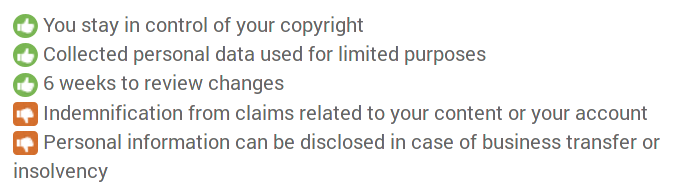
In ToS;DR, we also use this approach: for each point, there’s an iconic indication whether this is a good or a bad thing. Only, we allow for more variations:
But the major problem that I have with “Privacy Icons” is that they are too difficult to grasp. If you actually remove the text aside the icon itself, you realise that the icon itself is far from self-explanatory. This gets even more complex with the number of icons you add.
These icons are not universally understood. Here’s how the same concept is rendered differently by different Privacy icons sets:

Compare these with how a similar point would be addressed in ToS;DR:

which can be expanded with a plain-English paragraph and links to contextualise if the user wants more information:

There’s probably a way somewhere to learn from these different approaches and make an implementation that gets it right for users.
The EU already made such a thing possible with the energy efficiency labels. (They actually were a source of inspiration for ToS;DR classes.)
Let’s hope the next proposal gets it right with an icon system that is easier to understand and which gets rid of the confusing bits.
There's a lot to be said against how the implementation is suggested at the moment. For starters, in Europe the 'round red circle' means 'forbidden' in traffic signs. (Forbidden to go harder than 50km/h, forbidden to turn here, ...). So the encryption bord would be read as 'Forbidden to not encrypt.' (or even - wrongfully 'forbidden to encrypt', according to how quickly one scans the icon.) This might make sense for the first three, where keeping to the rules is mandatory to comply with EU law, but not for the encryption, and do not sell/rent, .. .
(A red triangle, signalling 'be alert' would be more in line with what they are trying to do here. Notify, not forbid.)
The second issue I have with this is that even companies who do 'the right thing', will be displaying six huge red 'dangerous' icons on their signup pages. And the green checkmarks do not counteract this enough. The negation in the text, with the 'negative connotation' text still highlighted, is not helping either, not that the checkmarks are not directly next to the icons. (For better scanning.)
So, very much not a fan. I see some great design & UX coming from some EU departments. Wish they'd actually ask these guys to have a look at these.
As they stand now, I'll have a hard time advising anybody to implement these when the GDPR comes into affect. If they are not improved upon, I'd likely suggest they take some of their two years grace period, and see if these have evolved for the better by then.
(I do look forward to seeing these on my credit card contract, loyalty card brochures, etc.. rather than having this information and opt-out conditions hidden in the 20 pages-long small print. Especially the 'disseminated' and 'sell or rent'.. . )