On the latest GNOME Empathy design
So now that I completed the upgrade, I see some new GNOME stuff coming in. Great, I like new stuff because I generally like the direction GNOME is taking. I can’t wait to see GNOME 3.10 with the high-resolution display capabilities!
So I opened one of the GNOME application that I use the most (and I have been using it for, what? 3-4 years?): Empathy. But this upgrade has got me wondering: do GNOME designers use it?
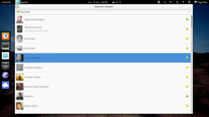
Okay, so Empathy has a new design since 3.6. This is how it looks like after upgrading:
First, I was like: “Heeeeey! where are the groups?” I mean, this is a useful feature when I need to find people related to something specific. For instance, I’ve got a group of contacts for FSFE but I also have one for Paris or Berlin. If I’m planning a trip to Berlin, I just open that group and go talk to friends who are there.
Fortunately, there’s a way to bring the groups back. But that’s not the point.
The groups are a very useful feature, I’m not sure why it makes sense to remove them by default. And anyway for people who don’t use groups, I suppose it does not change anything: so why remove them for people how might use them?
I had to find the Gnome release notes on the Web to see there was an option to bring the groups back. It just reminds me that there should be a better way to introduce users to design changes when doing system upgrades! For instance, when some Firefox addons upgrade, they open a new tab with release versions, etc.
The design changes are really questionable. The rationale on the release notes is consistency with the GNOME Contacts app. But I don’t understand this. The result is that the list view shows less people than before, so I can see less people connected at the same time, which makes the whole list view less useful.
Is that just because designers investigated that most people only have a handful of contacts connected at the same time? I doubt that’s the case. Most people I know say that they have more than 300 “friends” on Facebook usually… so I don’t think I’m the only one with constantly more than 30 people connected.
Or maybe it is because bigger picture looks nice…
A suggestion for real improvement
While there might be reasons for the redesign, it’s astonishing that this design did not solve the main problem with the list view. The Empathy list view has basically not changed since it was first made, and I already complained about it back then (probably I did not reach the right people, it was kind of silly of me to write that in French).
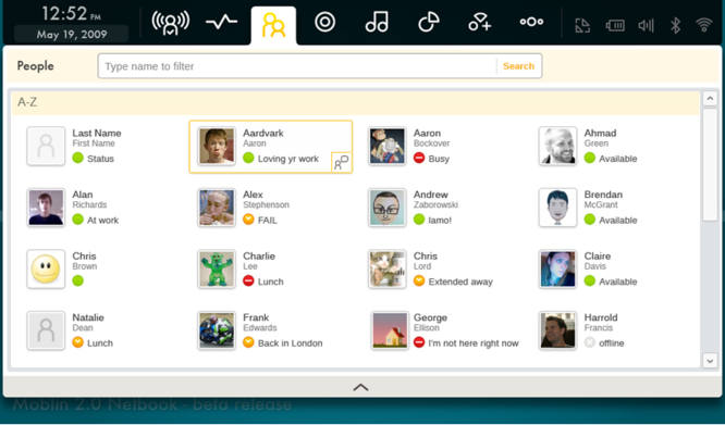
The main problem IMHO is that the list view does not adapt to the window size! Go have a look at the screenshot above. This is so silly, why insist on display each contact on a whole block? What strikes me is that the solution is obvious. Here’s how Moblin did it in 2009:
With the same screen estate, Empathy would be able to show 4 connected people at the same time, instead of 16. Combine this with a group view, and you’ve got a decent way to see who’s online; which is what the list view is for, right?
Update: I opened an issue about this https://bugzilla.gnome.org/show_bug.cgi?id=711667.
And apparently, GNOME is exploring other designs for the Chat application: https://wiki.gnome.org/Design/Apps/Chat. But that still seems like a long way to go, while my proposal seems like a quick fix.

